
I love black and white. I also love colour, but there's something about black ink on white paper which never fails for me. Looking through the Community Sketchbook pool on Flickr I found many images, all very different, and all of which I would like to have used - it was hard narrowing it down. I chose the three I'm featuring here because they seem to me to demonstrate some of the huge range of effects and feeling which can be achieved just with the use of black on white. Well, in Richard May's case it's black on a pinkish colour, but I love this drawing so I made an exception!
Family, Richard May

Direct, simple and very expressive. I want to know what's behind those smiles. Why is the speech in the bubble scribbled out? This image really draws me in - it's the confident, loose but bold lines which make this image so interesting and for me, compelling.
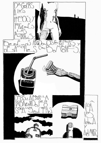
Something completely different - Oferta2 is part of a work in progress and Janitzio marries areas of fine line work and solid black and white to great atmospheric effect. There is a sense of time hanging in this image, created through the juxtaposition of finely detailed objects against the areas of solid black and the silhouettes of people standing in a featureless landscape in the top right of the page.
Oferta2, Janitzio Alatriste
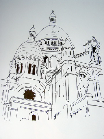
La Ola's drawing of Sacre Couer in Montmatre includes only minimal details together with exceptionally clean lines but don't you just feel the solidity and hugeness of the building? The perspective is spot on and really conveys both a sense of the history of Sacre Couer and of the sheer size of the building. The small areas of solid black help to create the illusion of three dimensional space, whilst the choice not to add shadows emphasises the upward thrust of both the perspective and the Sacre Couer itself.
Sacre Couer, La Ola
You can find more work by all of these artists in the Community Sketchbook Pool at Flickr.


No comments:
Post a Comment